Nicola Roberts
ECD
ABOUT
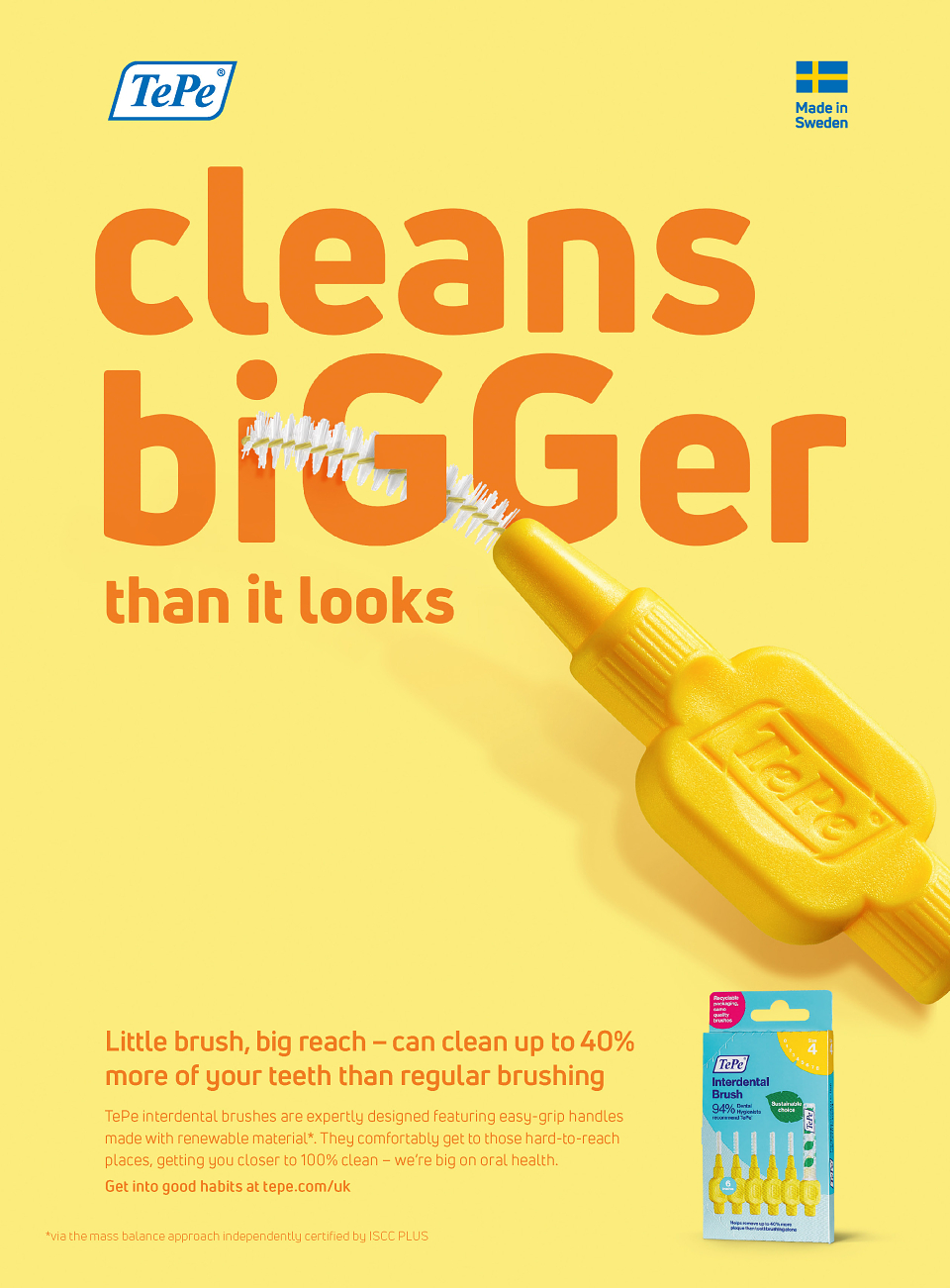
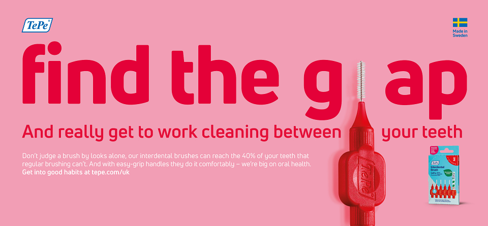
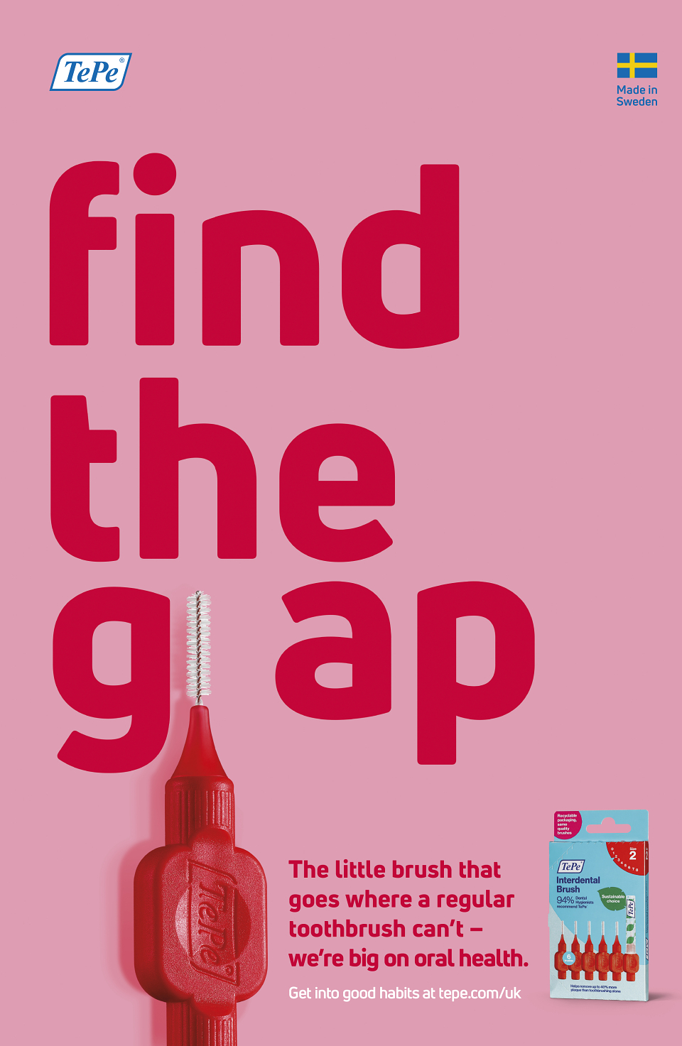
Big on Oral Health defies category norms; in a world full of bright white smiles and muted tones, we’re taking the vivid colours of the handles and the inherent playfulness of the product to create a visually disruptive campaign that’s bold and simple.
Playing with scale, proportion, and perspective not only gives us a visual point of difference; it makes interdental brushing seem less daunting and more accessible. And the interplay between brush and type lands expertise and design excellence – something that’s supported through engaging headlines and informative body copy.
For added engagement and cut-through, we tailored the creative to the media. This really came to life on train card panels and cross track posters with our ‘Find the Gap’ executions.
MADEIT CREDITS
-

TePeClient
-
adrian burkePhotographer -

Scott FranklinArt Direction | Creative Direction -
Scott FranklinArt Direction | Creative Direction -

Bray Leino -

Nicola RobertsECD -

Harrie HarrisHead of Client Services -
Anthony HurstHead of Retouching & Illustration -

Adrian BurkePhotographer