Design Bridge and Partners
London
ABOUT
London’s First Winery
The brief:
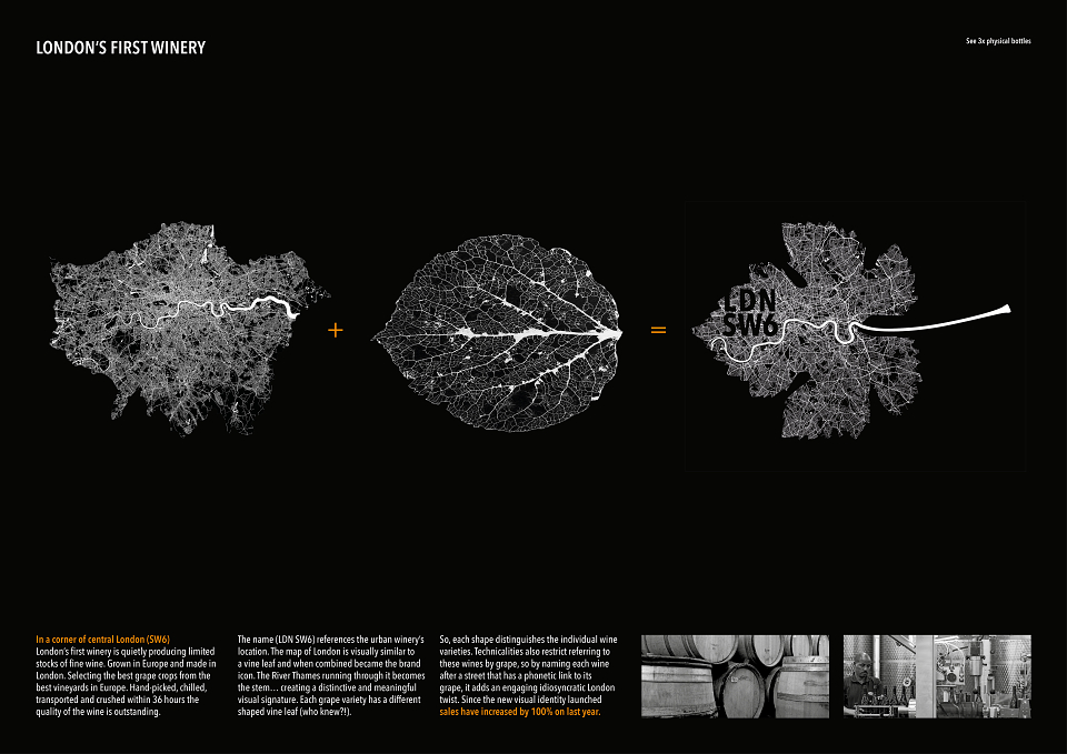
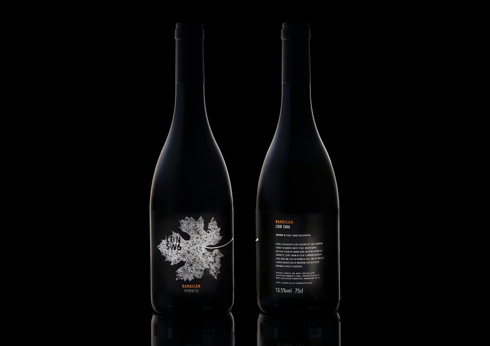
London Cru is the capital’s first winery, producing limited stocks of fine wine in London’s South West district. The best grape crops are selected from premium vineyards across Europe, transported to London and crushed at the winery within 36 hours. London Cru needed a name and visual identity for their signature range of wines. The brief was to unite the idea of fine wine with the unique urban location. As well as creating a strong visual identity for the brand, and signifying the different wines across the range, the designs also had to solve a particular wine industry technical constraint: the grape varieties themselves (eg. Chardonnay) could not be named on the bottles.
The creative idea:
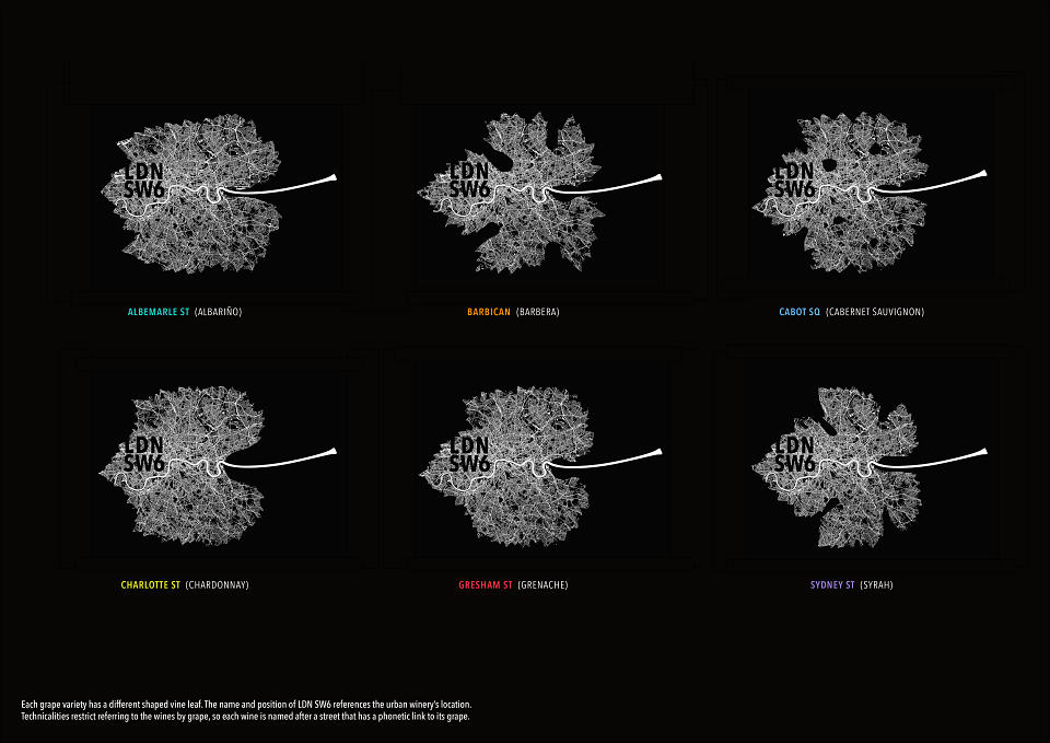
The map of London is visually similar to a vine leaf and when combined became the winery’s new brand icon. The River Thames running through it formed the leaf stem, creating a distinctive and meaningful visual signature. The range name LDN SW6 was chosen to reference the urban winery’s specific location, and placed over the appropriate area on the map. Each grape variety has a different shaped vine leaf, distinguishing the individual types of wine. Since these wines could not be identified by grape variety in writing, each was named after a street that has a phonetic link to its grape (eg. Charlotte St for Chardonnay).
Evidence of how the idea was received by the target audience:
The new design has been very well received by existing and new customers and restaurants, with overwhelmingly positive feedback. Sales have increased by 100% on last year (for the same varieties previously produced with different branding).
MADEIT CREDITS


Annual 2017 WinnerLondon's First WineryPackaging
Contributor:
Invite
x3
Design Bridge and Partners has been a Contributor since 25th November 2015.