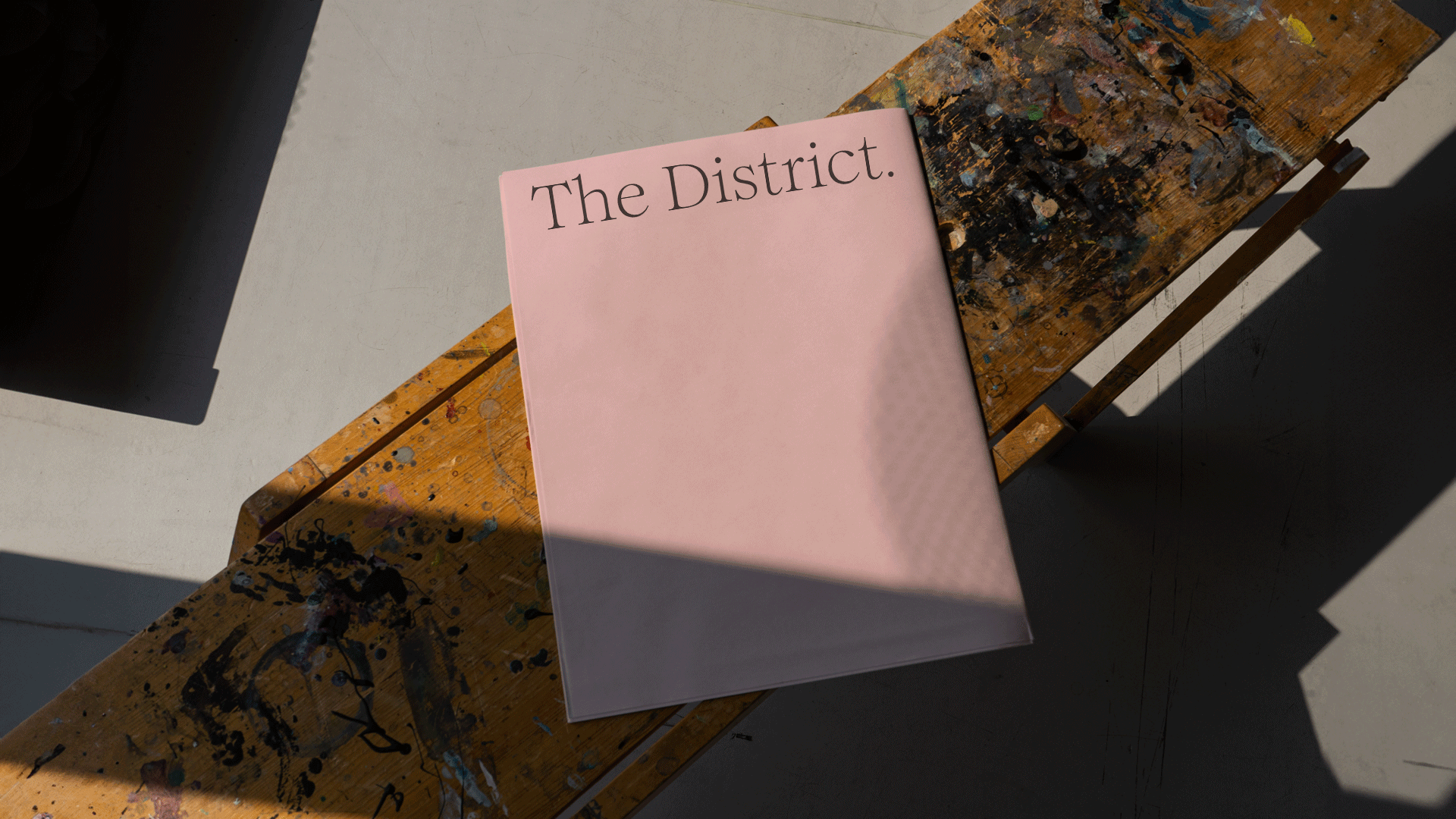
The District
Cambridge
ABOUT
BRIEF
To conceive and design a printed piece that captures the essence of our practice; our love of people, language, and understated and appropriate design. It would be sent to key clients, prospects, partners and friends as well as offered for sale on The Brand Identity to like-minded peers.
MEDIUMS
This was spontaneous and fun, not measured or analytical. As such the medium was kept simple - a piece of newsprint that gave the concept an editorial and almost throwaway feel. It was designed (and produced) to be a moment in time.
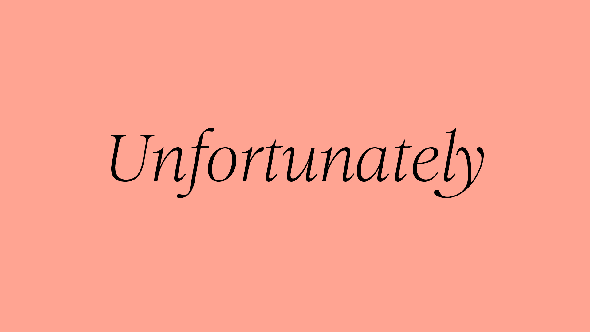
CONCEPT
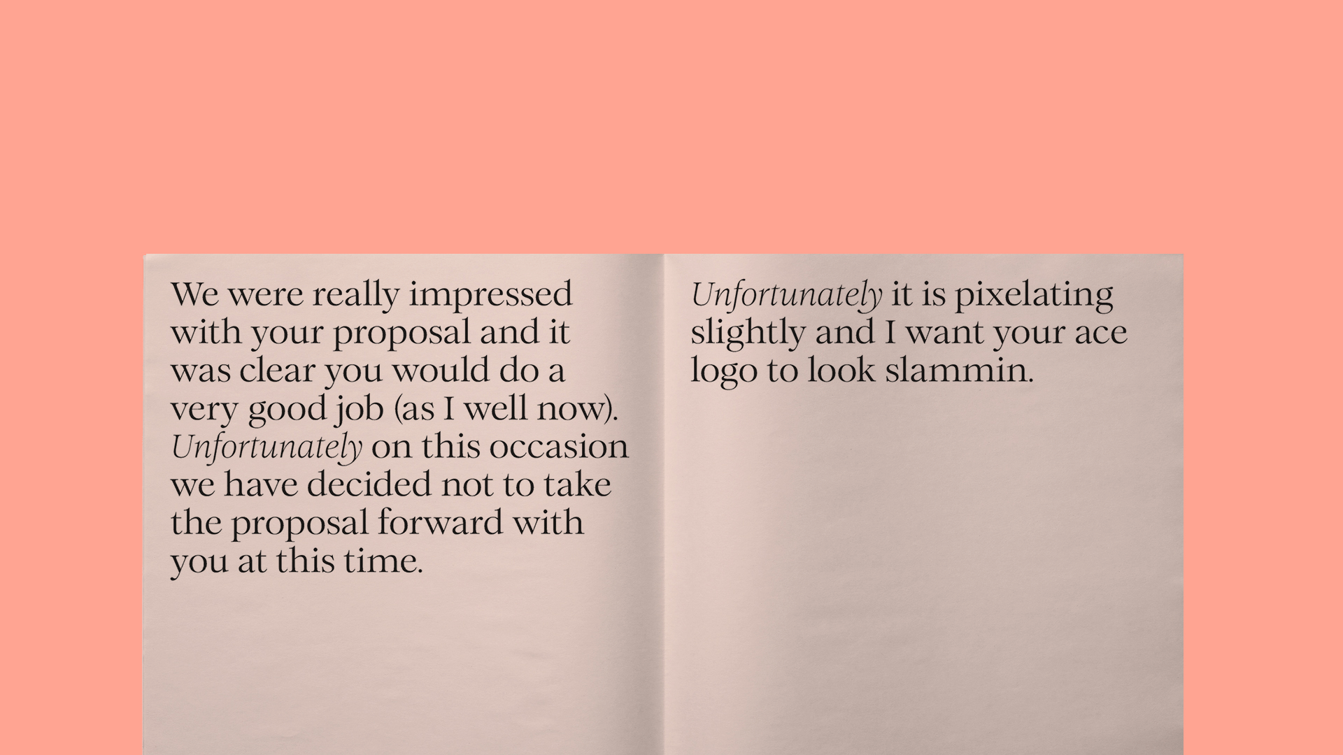
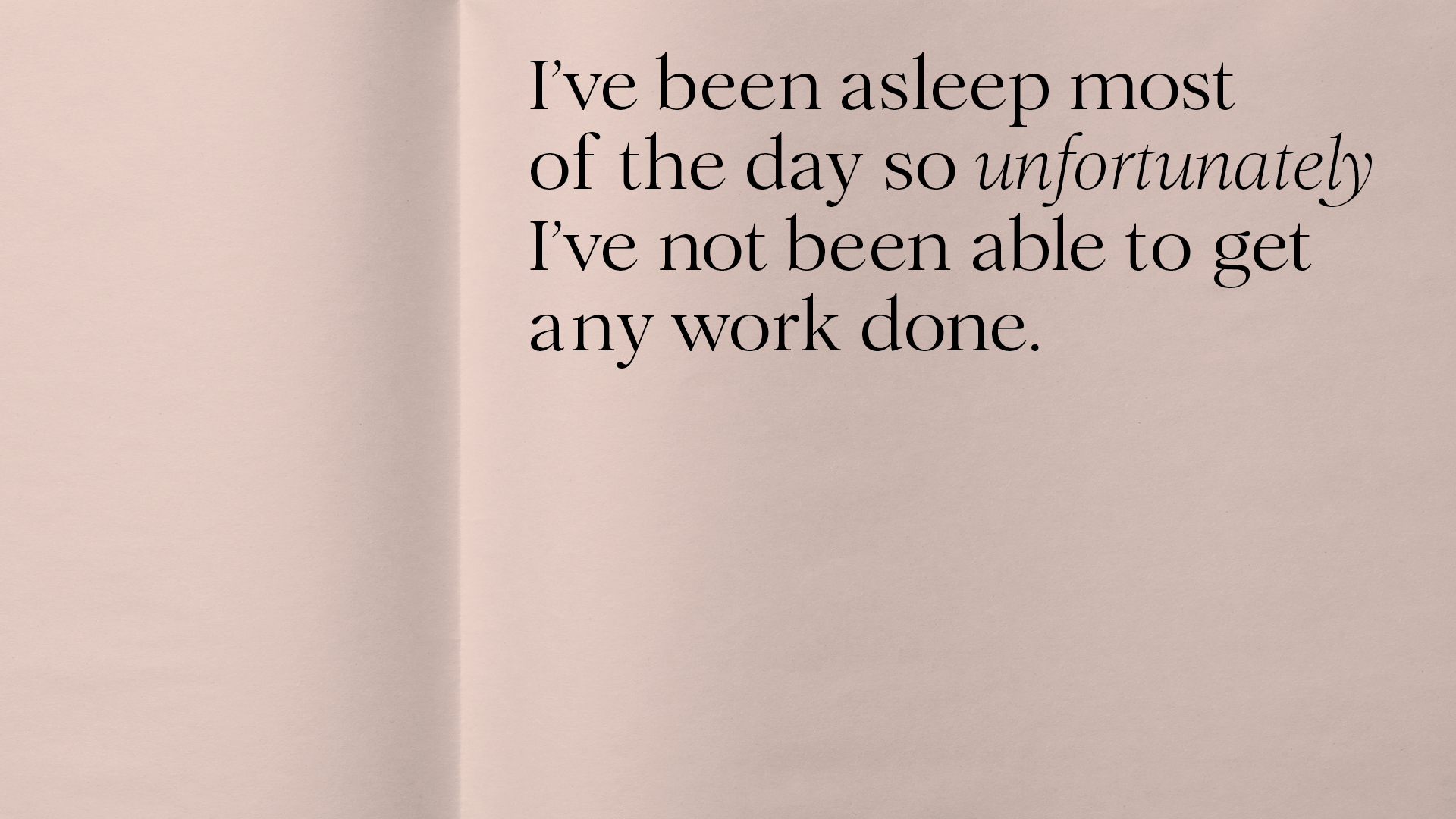
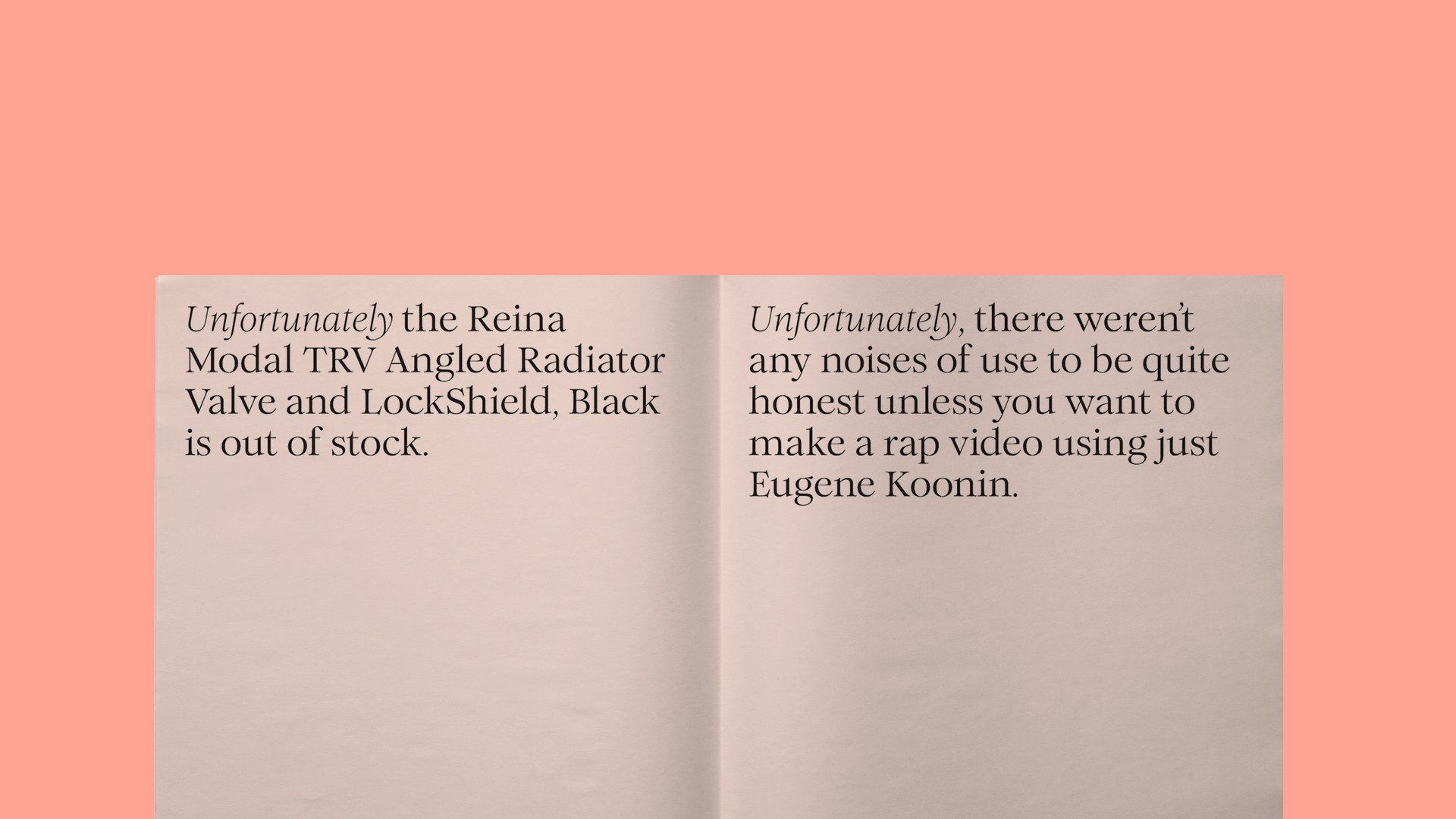
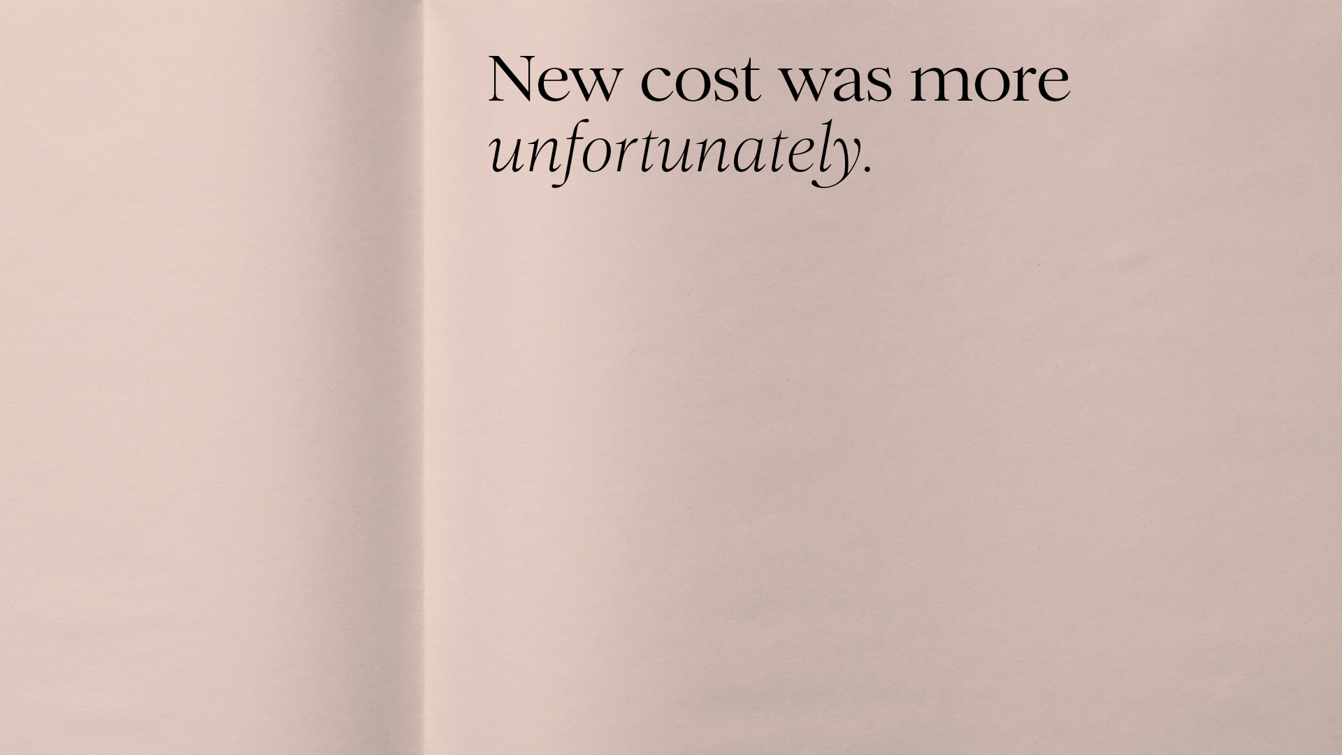
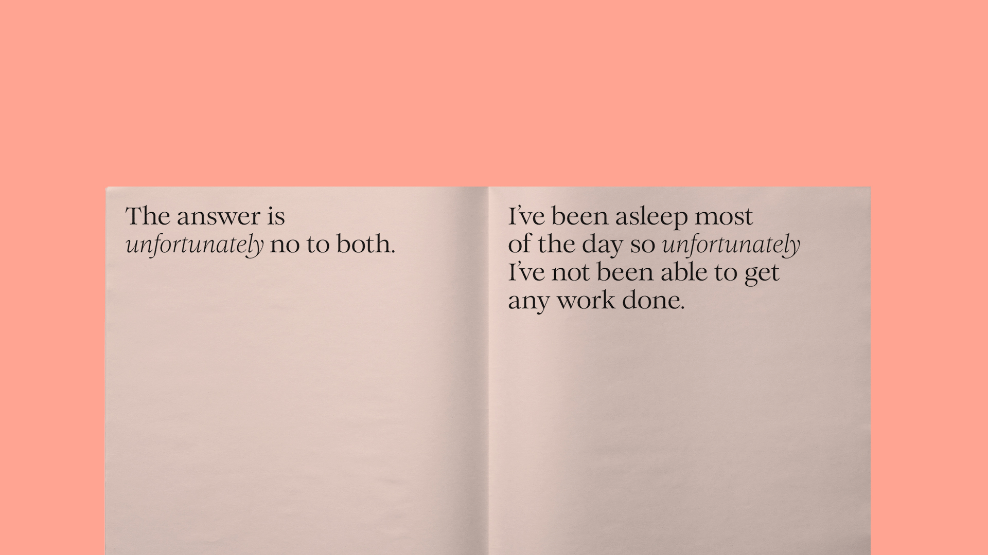
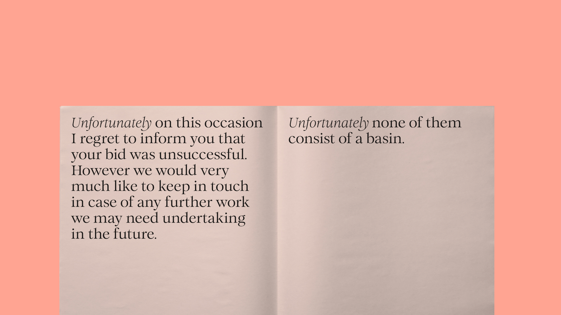
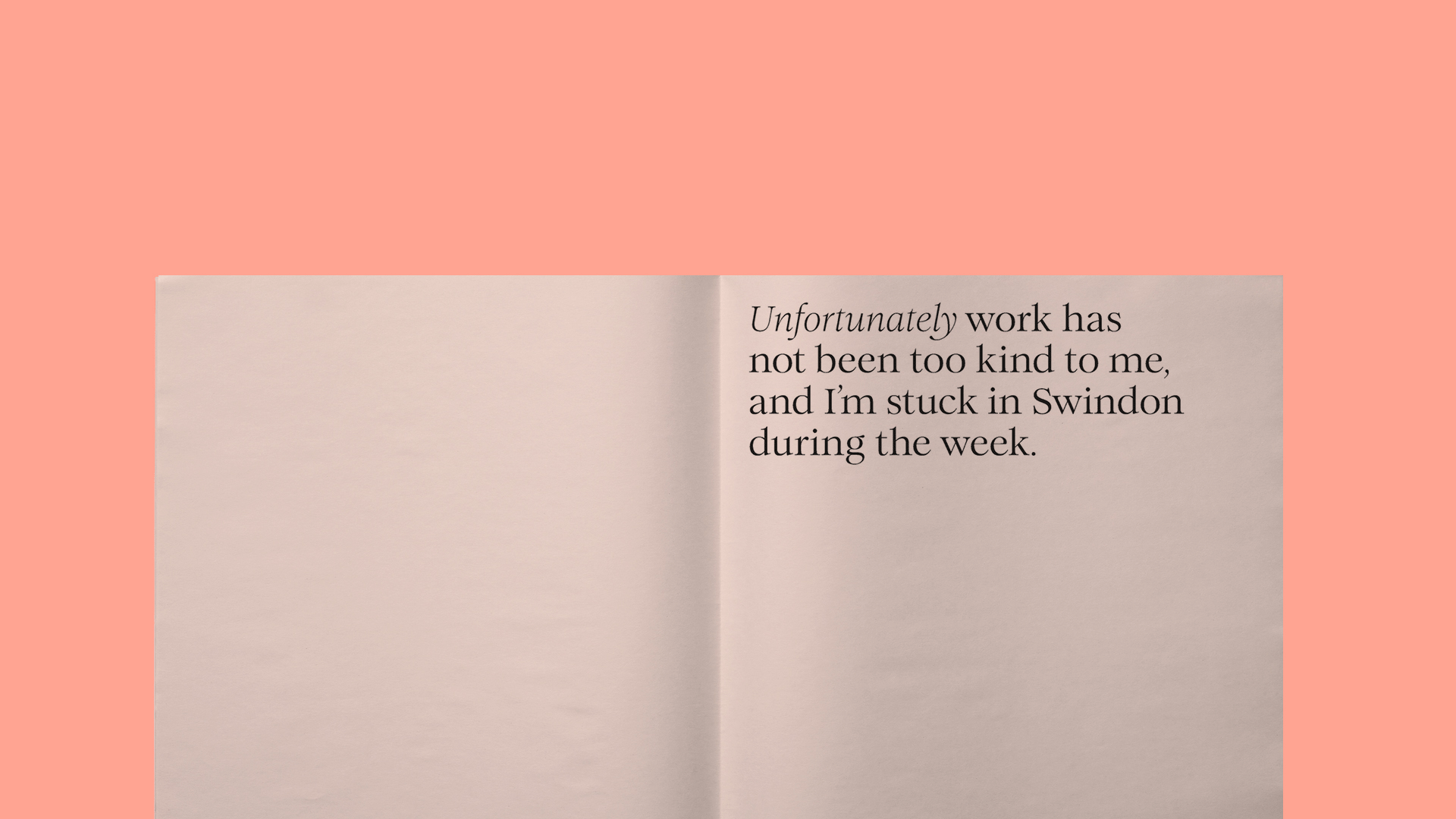
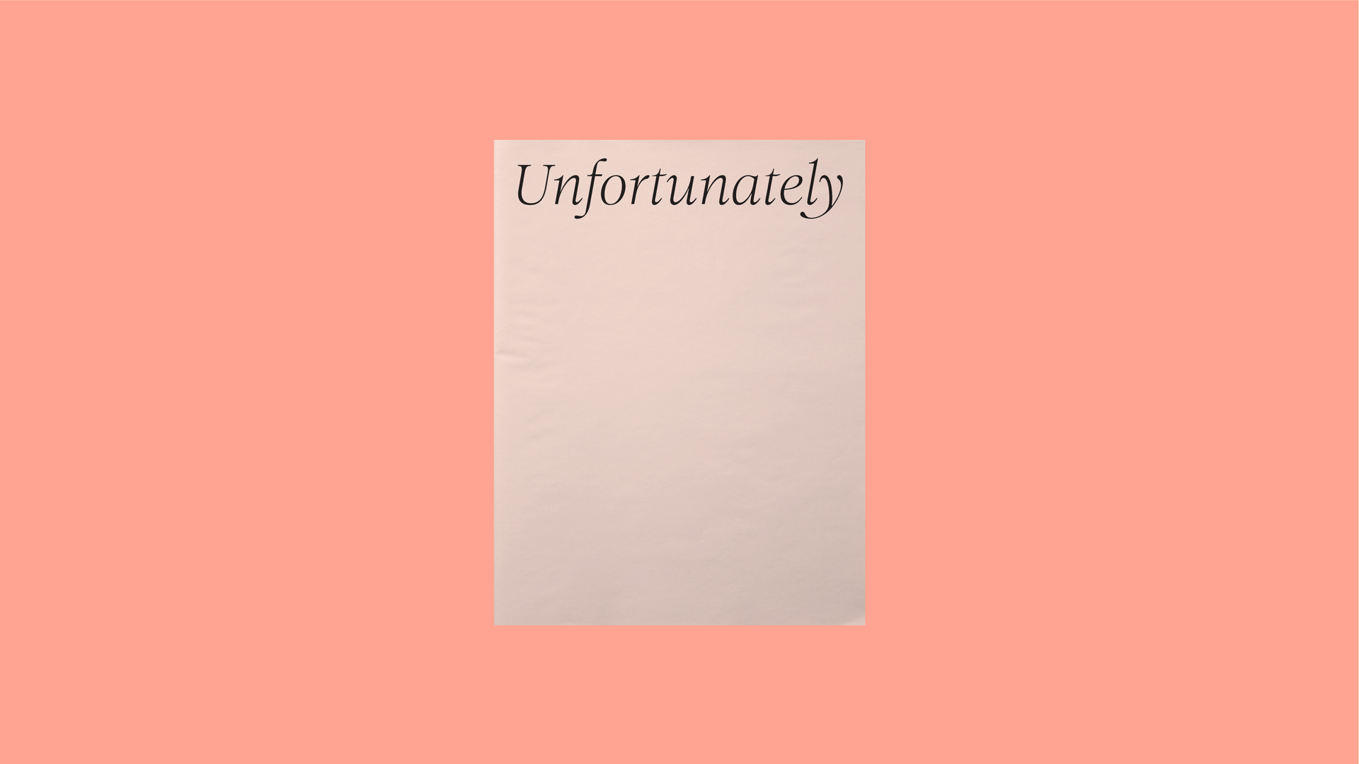
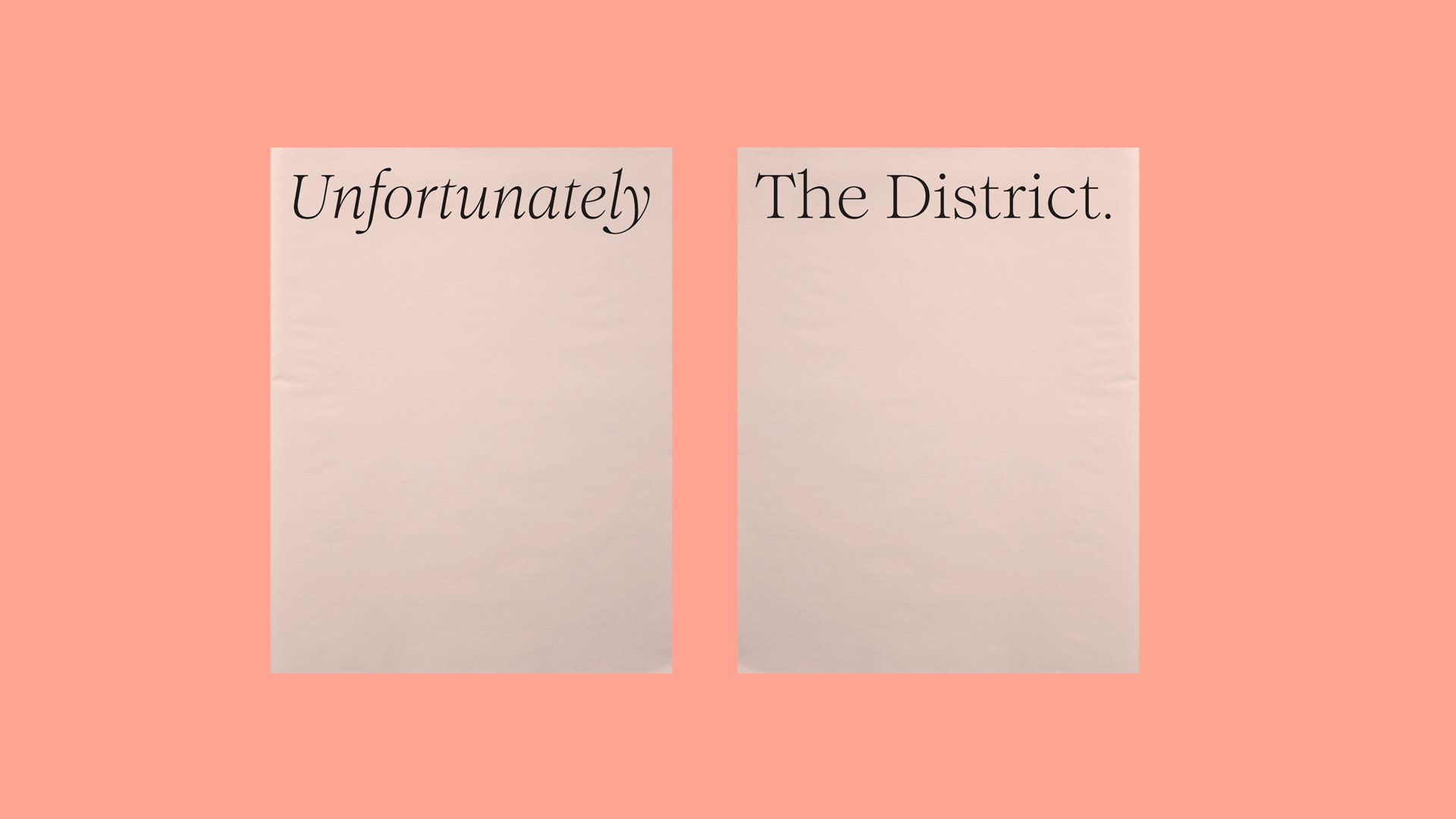
Unfortunately working in design isn’t always as glamorous as it may sound. Our love of people and language compelled us to collect and collate all of the unfortunate emails that have landed in our inbox over the years. They capture the rich tapestry of life covering ‘thank you but no thank yous’, unavailable sanitary ware, unusable images and of course, the weather. In this paper we presented the good, the bad and the misspelt.
EXECUTION
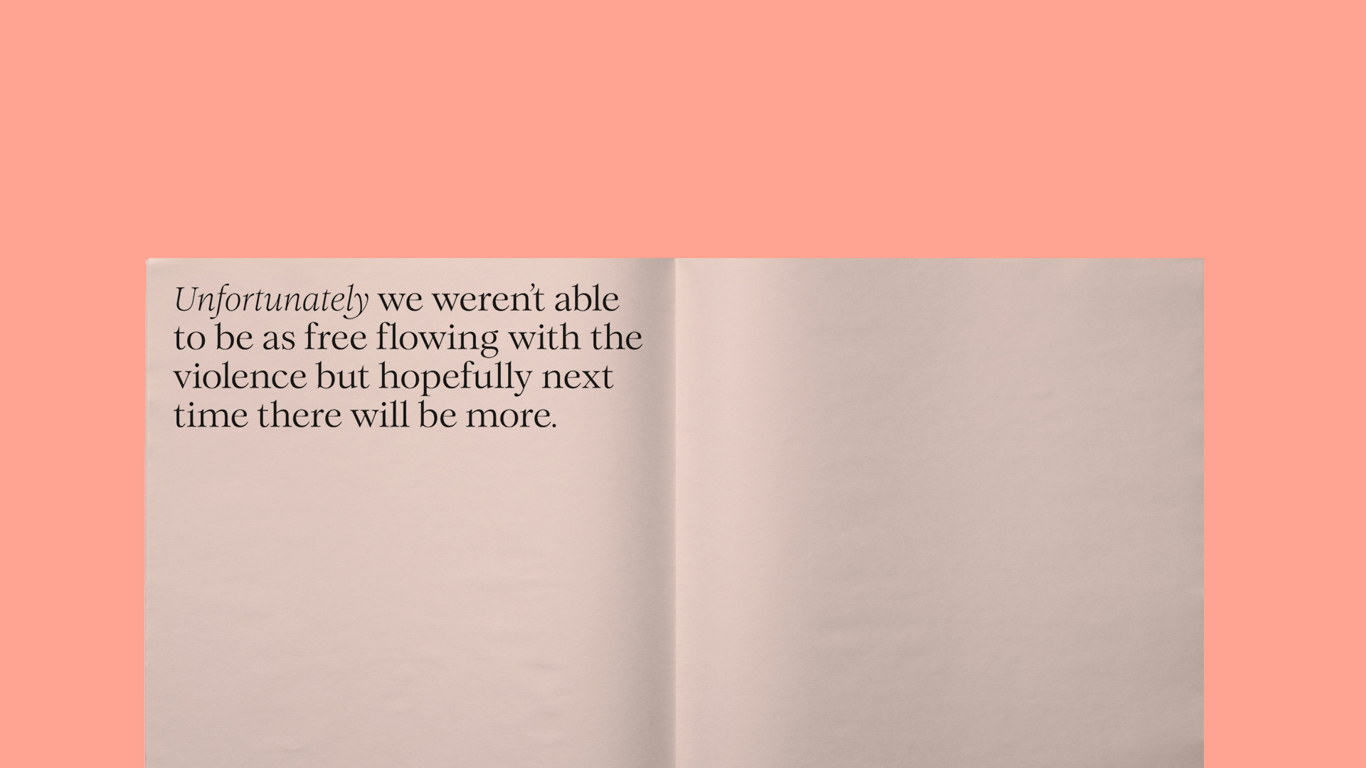
Execution was simple. After playing around with various design aesthetics we decided they were trying too hard and that the content provided all the wit and effort required. Using a playful and bookish typeface Romee we simply set each 'unfortunately' in plenty of negative space, one per page, allowing the reader to easily digest and enjoy.
RESULTS
The paper has been met with laughter and knowing glances from fellow creatives (and home renovators). The first edition sold out quickly on The Brand Identity. A series beckons.